Podcast
Communication Untangled
Join host Sue Keogh for the podcast that explores the many facets of communication that influence our behaviour - but often go unnoticed.
Like instructions for medical devices. How menus are designed and recipes are written. Voting slips and democracy. Sound design in gaming that heightens our emotions as we play. Motorway typography. How colour is used to change consumer behaviour.
Together with expert guests, we untangle communication - shining a light on the techniques to get across critical messages in your marketing, business and brand.
Finalist in both Culture and Business in the 2025 Independent Podcast Awards.

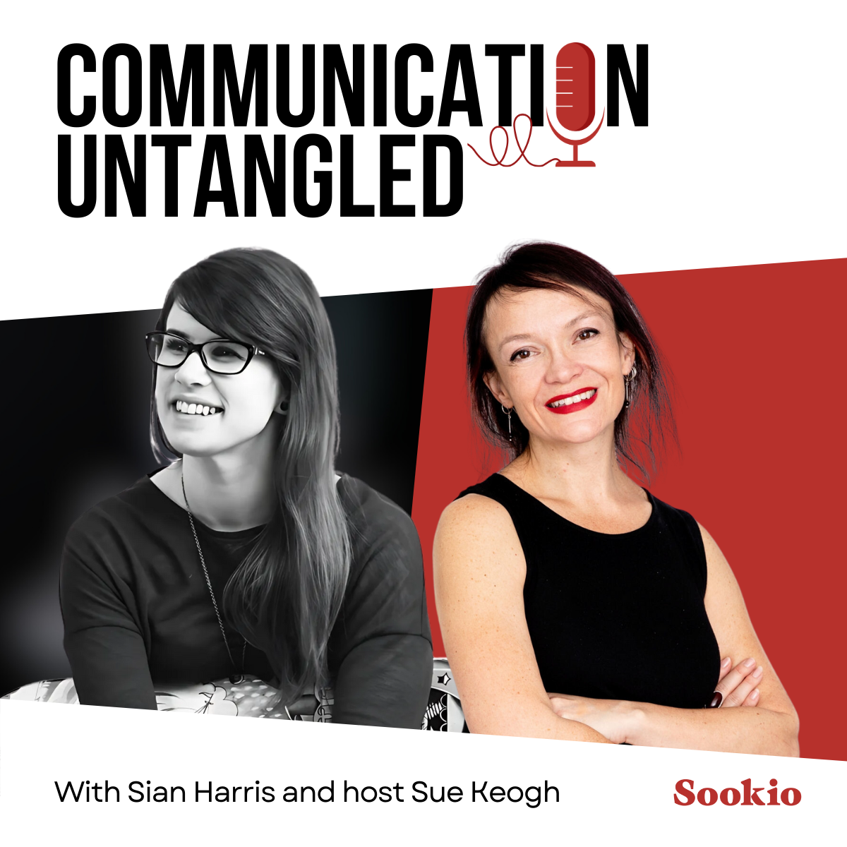
Series 2, Episode 6: Untangling Sound
Sound designer Sian Harris (Star Wars, LEGO, Need for Speed) from Fuse Games explains how audio in games has a huge impact on our emotional response as we play. We talk elephants, toucans, and why she’ll never replace humans with robots.
Plus, remember the classic Nokia ringtone? It was heard nearly 2 billion times a day at its peak – but now we keep our devices on silent.
-
Sound designer Sian Harris (Star Wars, LEGO, Need for Speed) from Fuse Games explains how audio in games has a huge impact on our emotional response as we play.
We talk elephants, toucans, and why she’ll never replace humans with robots.
Plus, remember the classic Nokia ringtone? It was heard nearly 2 billion times a day at its peak – but now we keep our phones on silent.
Whether you're accelerating at speed in Grand Theft Auto, collecting coins in Super Mario, or you've just caught a fish in Animal Crossing with a satisfying splosh, the way the sound is designed in gaming has a huge impact on our emotional response as we play. It helps you become immersed in whole new worlds, and alerts you to points won – and lives lost.
Someone who knows all about games audio and the techniques used to heighten our emotions is Sian Harris, Lead Sound Designer at Fuse Games. She's worked on numerous titles in the Star Wars and LEGO franchises, along with racing game Need for Speed and Sea of Solitude, set in a flooded city with big monsters making scary noises!
She tells host Sue Keogh about all the subtle ways she uses sound to get people really tuned into the game...and how she strikes a balance between using AI technology and keeping it old school.
Speaking of which! We’ll also remember the famous Nokia ringtone, a total classic from the early days of mobile phones which at its peak was heard nearly two billion times a day.
About Sian Harris
Sian Harris is an award-winning Lead Sound Designer currently working at Fuse Games. With over a decade of experience in sound design, audio direction, leadership and mentoring. Sian has played a pivotal role in shaping the soundscapes of some of the most innovative games in the industry such as the Need for Speed, Battlefield and Star Wars franchises.
Take a look at her reel to see some of her work:
https://www.youtube.com/watch?v=x3MXt35X2Ts&t=2s&ab_channel=SianAudio
Useful links
Connect with Sian on LinkedIn: https://www.linkedin.com/in/sian-harris-b4a13644/
Subscribe to her YouTube channel: https://www.youtube.com/@SianAudio-pq6tg
Fuse Games: https://fusegames.com/
---
Sookio podcast page: https://www.sookio.com/podcast
Produced by Rob Birnie at Made By DBM: https://madebydbm.com

Series 2, Episode 5: Untangling Recipes
Chef and food writer Noor Murad explains how you test and proofread recipes, the difference in writing recipes in Arabic and English, and questions whether social media put us under too much pressure to make our food look glamorous.
We also look at a different kind of recipe – the formulations for beauty products – and the challenge for iconic brands like Chanel in not giving away trade secrets.
-
Chef and food writer Noor Murad joins Sue Keogh to Untangle Recipes. Part of Yottam Ottolenghi’s Test Kitchen team, she’s cooked trackside at Formula 1 and trained at the Culinary Institute of America in New York.
She explains how you how you test and proofread recipes, the difference in writing recipes in Arabic and English, and questions whether social media put us under too much pressure to make our food look glamorous.
We also look at a different kind of recipe – the formulations for beauty products – and the challenge for iconic brands like Chanel in not giving away trade secrets.
Sue Keogh: One of my early copywriting gigs when I first went freelance was to get hundreds of recipes from print – onto a new online portal. It had literally never occurred to me before that point, that there was a consistent structure in the way that recipes were written.
You list the ingredients in order of use, putting the most important ones first…and any the salt and pepper and other seasoning goes at the end. It suddenly seemed so obvious! But I’d just never noticed.
And the way a recipe is written affects how well we cook it too. So in this episode we’re going to untangle recipes and find out how it’s done.
I’m joined by Noor Murad, who is part of Yottam Ottolenghi’s Test Kitchen team. Her recipe books include Shelf Love and Lugma – an ode to the food she grew up eating during her childhood in Bahrain.
She’s cooked trackside at Formula 1, and trained at the Culinary Institute of America in New York. She now lives in London, and invited me over to the very kitchen where she develops her delicious Middle Eastern recipes.
She tells me how you test and proofread recipes, how social media puts us under too much pressure to make our food look glamorous, and the challenges of translating clotted cream into different languages.
We’ll also think about a different kind of recipe – the formulations for beauty products – and the challenge for iconic brands like Chanel who have to list the ingredients by law – but not give away their trade secrets.
About Noor Murad
Bahrain-born, London-based and New York trained, Noor Murad joined the Ottolenghi Test Kitchen in 2018, where she worked as a recipe developer for Falastin and Flavor as well as Ottolenghi's New York Times and Guardian columns.
She became the head of the Ottolenghi Test Kitchen, and wrote the Ottolenghi Test Kitchen books: Shelf Love and Extra Good Things.
Her own recipes have featured in the New York Times and she has cooked on BBC's Saturday Kitchen. Her Middle Eastern roots have a strong influence on her cooking, with Arabic, Indian, and Persian flavours making a prominent appearance in her recipes.
Useful links
Follow Noor on Instagram: https://www.instagram.com/noorishbynoor
Buy Noor’s book Lugma (which means ‘a bite’ in Arabic, yum!
https://www.penguin.co.uk/books/466601/lugma-by-murad-noor/9781837832019
---
Sookio podcast page: https://www.sookio.com/podcast
Produced by Rob Birnie at Made By DBM: https://madebydbm.com
Links recorded at Cranes Nest podcast studio in Cambridge: https://www.thecranenest.co.uk/

Series 2, episode 4: Untangling Tickets
A ticket is way more than just a slip of paper that gets you into the gig, show, or match. But with the move to QR codes, barcodes and digitisation, do they still feel special?
Jules Akel draws on his extensive experience in designing beautiful tickets for Lord’s cricket and Wimbledon to build a sense of anticipation ahead of the day. We talk forgeries, buried treasure, and the power of wit in helping brands connect with the audience. And how does Disney take tickets to a whole other level, with their wearable technology – the MagicBand?
-
A ticket is way more than just a slip of paper than gets you into a gig, show, or football match. It’s something you gaze at longingly as you look forward to the event, and hold onto afterwards as a keepsake. It’s as much about anticipation – as the basics of gaining entry on the day.
In this episode we’re going to Untangle Tickets, with designer Jules Akel.
For 25 years he created beautiful tickets for Marylebone Cricket Club at Lords. And he has designed an abundance of materials for Wimbledon, Ascot, whiskey distilleries and music festivals.
Of course, nowadays – we just flash a QR code or barcode stored on our phone, but as Jules explains, we can still design tickets so they feel special. Giving us a sense of joy and fun about the whole experience.
Along the way we talk forgeries, buried treasure, and the power of wit in helping brands connect with the audience.
We also break off to look at how Disney take tickets to a whole other level, with their wearable technology – the MagicBand.
About Jules Akel
Jules is a graduate of Preston Poly where he was taught about the primacy of the idea over decoration. Of course the art is important, but in the service of communication. He has enjoyed creating all manner of designs to help companies large and small to prosper. These companies have included Marylebone Cricket Club, Wimbledon Tennis Championships, Greenpeace, L’Oreal, Dalwhinnie Distillery, Marlborough College, Wellington College, Skibo Castle and others.
Useful links
Connect with Jules Akel on LinkedIn: https://www.linkedin.com/in/jules-akel-33028a13
Explore his design work https://www.akel.co.uk
Buy his book, Cricket Tickets. It’s available from Christopher Saunders the publisher.
---
Sookio podcast page: https://www.sookio.com/podcast
Produced by Rob Birnie at Made By DBM: https://madebydbm.com
Links recorded at Cranes Nest podcast studio in Cambridge: https://www.thecranenest.co.uk/
And thank you to Christian Wolmar for kindly allowing us to use your front room to record! Listen to his podcast Calling All Stations: https://cogitamus.co.uk/calling-all-stations

Series 2, episode 3: Untangling votes
“Democracy is a design problem.” Whitney Quesenbery, Co-Founder of the Center for Civic Design in Washington DC, talks voting slips and the many factors that influence how we behave in the polling booth.
We’ll talk hanging chads. Dogs in polling stations! And we pop on a posh frock and prepare a tearful speech to take a look at the Oscars and how the Academy votes for the most sought-after awards in entertainment.
-
“Democracy is a design problem.” Whitney Quesenbery, Co-Founder of the Center for Civic Design in Washington, talks voting slips and the many factors that influence how we behave in the polling booth.
We’ll talk hanging chads. Dogs in polling station! And we pop on a posh frock and prepare a tearful speech to take a look at the Oscars and how the Academy votes for the most sought-after awards in entertainment.
You’re in the polling booth. Just you, the ballot paper and a pencil on a string. You’re hovering over the names as you decide where to put your cross.
Can the design of this tiny slip of paper affect how you vote? Can you make sense of the information? Do you just go for the candidate at the top of the list? In this episode we’re going to explore a small-but-important part of democracy; the voting slip.
Our guest is someone who cares deeply about the design of ballots. Whitney Quesenbery is the Co-Founder and Director of the Center for Civic Design in Washington. She advises government organisations, non-profits and tech companies on best practice in election design.
Their core principle is: ‘Democracy is a design problem’. Elections should work for everyone, and as she explains, design is a tool for building a better democracy where more people can take part.
About Whitney Quesenbery
Whitney is the director of the Center for Civic Design, solving democracy as a design problem and creating a voter experience that invites everyone to participate.
Her work in civic design began with a ballot that changed history. Six presidential elections later, she is still excited about finding effective ways to engage voters.
The Center’s work to reimagine elections includes working with election offices on the processes of democracy, with partners on innovative election technologies, and researching best practices in election design.
An authority on gathering user insights to design products where people matter, expertise gained in her work with government, nonprofit, and tech companies, she’s written 3 books — A Web for Everyone: Designing accessible user experiences, Storytelling for User Experience, and Global UX — to help keep users in mind throughout the creative process.
Useful links
Connect with Whitney on LinkedIn: https://www.linkedin.com/in/whitneyq
Explore the Center for Civic Design: https://civicdesign.org/
https://www.linkedin.com/company/center-for-civic-design
They have extensive resources that support good election design.
—-
Produced by Rob Birnie at Made By DBM: https://madebydbm.com
Links recorded at Cranes Nest podcast studio in Cambridge: https://www.thecranenest.co.uk/

Series 2, episode 2: Untangling Instructions
Lucy Sheldon and Clare Beddoes from Cambridge Design Partnership explain how to develop clear instructions for medical devices, and what Apple can teach us about making products so intuitive we don’t need instructions at all.
And how do LEGO make instructions part of the act of play itself?
-
When you walk into reception at Cambridge Design Partnership, you see lots of intriguing case studies on display – from heart catheters to smart pills to nasal swabs.
As an innovation consultancy, it’s critical that people can actually use the medical devices they develop. Which is where clear instructions come in.
Lucy Sheldon is a Human Factors Engineer, focusing on good interaction design – helping people be at one with the technology they’re using – not battling against it.
Clare Beddoes heads up Drug Delivery, thinking about the needs of the patient and medical teams. She works closely with Lucy’s team to make sure the drugs can be used safely, minimising risk in a very risk averse sector.
We talk about the importance of sound and visuals in helping people use devices properly – and how they consider the emotional state of the end user, whether it’s someone using an Epi-Pen in a panic - or nervously taking a pregnancy test in the bathroom.
And we take a break in the middle for playtime! Looking at LEGO and instructions aren’t just functional, they’re all part of the fun too.
Useful links
Connect with our guests on LinkedIn
Clare Beddoes: https://www.linkedin.com/in/clare-beddoes-661b2913
Lucy Sheldon: https://www.linkedin.com/in/lucysheldon
Cambridge Design Partnership: https://www.linkedin.com/company/cambridge-design-partnership
---
Produced by Rob Birnie at Made By DBM: https://madebydbm.com
Links recorded at Cranes Nest podcast studio in Cambridge: https://www.thecranenest.co.uk/

Series 2, Episode 1: Untangling Captions
Hector Minto, Lead Accessibility Evangelist for Microsoft explains how AI is transforming the ability to create fast, accurate captions, and how to make your digital content more accessible and inclusive. Plus a trip to Tate galleries, and how the clarity of their artwork descriptions make everyone feel welcome.
-
About Hector Minto
Hector is a dedicated leader in accessibility and leads Microsoft customer and partner engagement strategy for accessibility, growing awareness of assistive technology inside the largest employers across all geographies.
He has worked in the field of Assistive Technology (AT) and accessibility for over 25 years, working with both established and emerging technologies, maximising their effectiveness across the wide range of people with physical, learning and sensory disabilities.
Hector is the current UK Government Disability and Access Ambassador for the Technology and Website sectors. He actively contributes to government consultations on disability inclusion and promotes inclusive design, product accessibility, inclusive hiring practices, and accessibility innovation.
His dedication to accessibility and his influential advocacy for disability rights have made him a visionary leader in the industry. His work continues to inspire and shape the future of inclusive technology..
Useful links
Accessibility at work | LinkedIn Learning In this course, Hector covers the importance of Digital Accessibility for the Modern Workplace.
Accessibility 101 | YouTube This course is designed to provide you with foundational knowledge on accessibility and disability inclusion.
For all support issues, email the Enterprise Disability Answer Desk. This is a support resource for organisations that have questions about the accessibility of Microsoft products and product conformance with accessibility standards.

Series 1, Episode 1: Untangling Brand
Designer Harry Pearce from Pentagram tells us about the visual identities he’s developed for V&A South Kensington, Liberty and Moth drinks – and why brand guidelines are critical in keeping everything beautifully consistent across print, packaging and digital formats.
We also take a look at NASA, and how their Graphic Standards Manual shows the brand evolution from a meatball…to a worm.
-
About Harry Pearce
Having studied at Canterbury College of Art, Harry co-founded and ran Lippa Pearce Design before becoming a Pentagram Partner in 2006.
He has devised identities, installations, posters, packaging, books for; Liberty, Thames & Hudson, Guggenheim, Royal Academy of Arts, Phaidon Press, Pink Floyd, Shakespeare’s Globe, PEN International, and the UN. Since 1993 he has been an active member of the advisory board for WITNESS.
Books; Typographic Conundrums and Eating with the Eyes.
See Harry’s full biography on the Pentagram website
Show notes
Harry works alongside so many creative geniuses on these projects, including designer and Pentagram partner Marina Willer, who created the Young V&A identity work.
Writers on the overall V&A project were Naresh Ramchandani and Ashley Johnson.
Inspiration
And here are some interesting things to have a look at!
• Creative Review article on the new V&A Museum branding and visual identity
• Pentagram case study: Liberty LBTY
• Pentagram case study: V&A South Kensington
• NASA Graphics Standards Manual from 1975
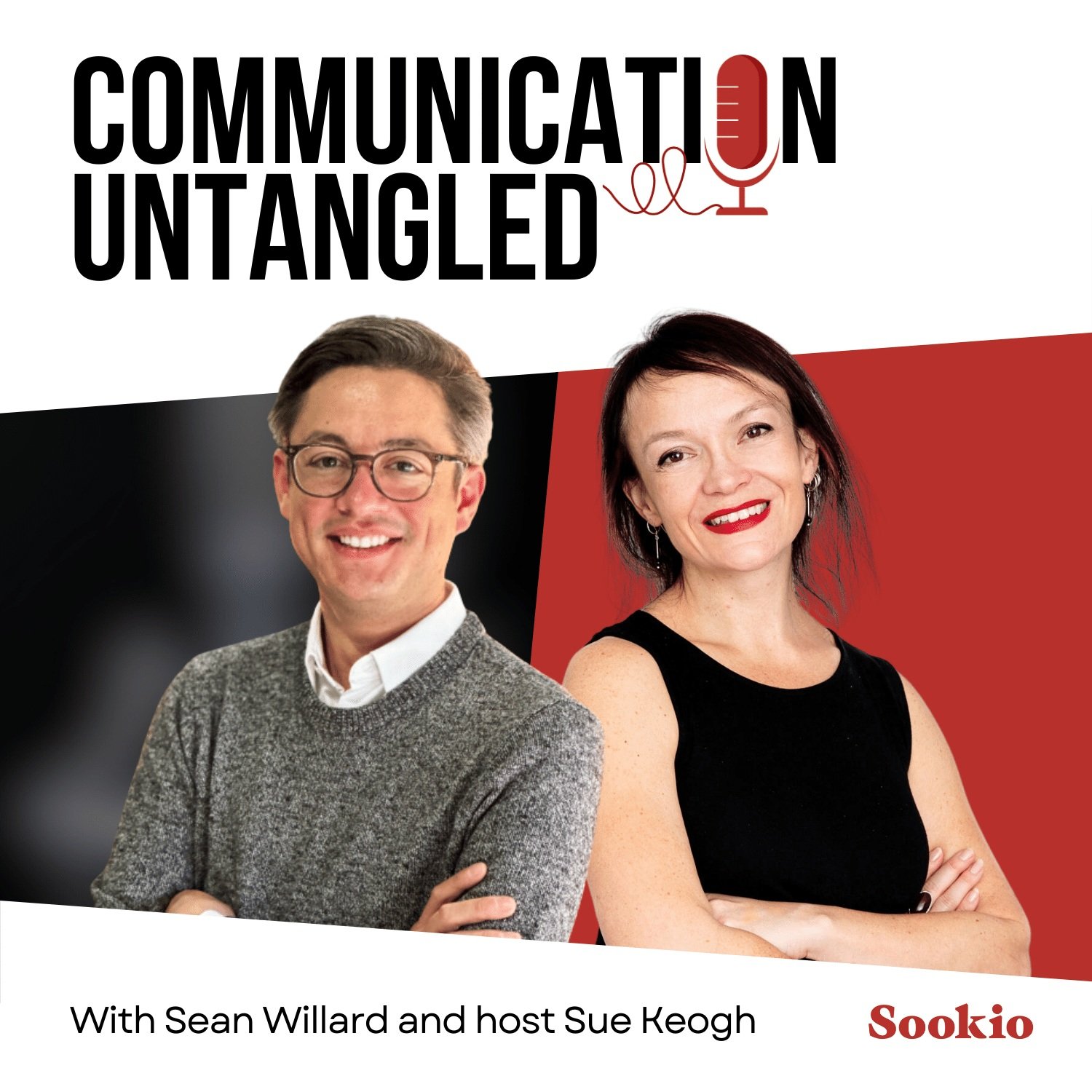
S1, Episode 2: Untangling Menus
Sean Willard from The Menu Engineers joins us to talk menu design. What big shifts are we seeing in this post-pandemic era? How do the fonts, colours and material they’re printed on affect our choices? And why should every restaurant offer something that lets you blow the budget?
Plus! How does Netflix use idleness aversion to keep us endlessly scrolling through their menu? Listen now…
-
About Sean Willard
Sean Willard is a seasoned Menu Engineer dedicated to assisting restaurateurs and hospitality operators worldwide in the creation of optimised menus.
His approach melds the precision of science, the finesse of art, the insights of data, and a wealth of industry experience to empower restaurateurs in crafting menus that not only bolster profitability but also elevate the overall guest dining experience.
With a distinguished academic background from Cornell’s prestigious Hotel School and an extensive tenure within the restaurant industry spanning over two decades, Sean brings a wealth of knowledge and practical expertise to the realm of Menu Engineering.
His journey into this specialized field was cultivated under the mentorship of the late Gregg Rapp, a luminary in the discipline who laid the foundations for many of the methodologies and principles still revered today.
Get in touch with Sean via menuEngineers.com, on Instagram or LinkedIn.

S1, Episode 3: Untangling FORMS
Iain Boyd and Adam Robertson from GOV.UK Forms at the Government Digital Service join us to share best practice in designing online forms to capture information efficiently and ethically.
Plus, discover the dark patterns on the web which set out to trick us.
-
Online forms. They’re either so intuitive you hardly notice you’ve filled them in. Or they take so long to complete that you just lose the will to live.
Or maybe you’re the one creating the form and trying to gather the information. People just don’t fill them in properly! How can you work with data that’s incomplete?
An organisation dealing with this issue on a massive scale is Government Digital Service, who are behind GOV.UK, the website for the UK Government.
The goal is to make digital government simpler, clearer and faster for everyone.
More than 13 million people use GOV.UK each week, and there are more than a billion transactions completed on the site a year – things like applying for a driving licence or filing a tax return or renewing your passport.
GDS are introducing their new Forms Builder tool and it’s designed to make Government forms more accessible and easier to fill in. They’ll be faster to process too, with fewer errors.
Our two guests on this episode are both from GOV.UK Forms at Government Digital Service. They share best practice in designing online forms so that not only do more people fill them in – but you get accurate data too:
Adam Robertson, Senior Product Manager
Iain Boyd, Engagement Lead at GOV.UK at the UK Government Digital Service and Iain Boyd from GDS
And in complete contrast to this ethical, transparent approach, you’ll find out about dark patterns on the web, and why Amazon, Google, Meta and the makers of Fortnite are being fined millions of dollars for bad practice and tricking users into doing things they simply never set out to do.
And who’s clamping down on nudges and sludges, biased framing and confirmshaming once and for all?
Show notes
GOV.UK Forms builder tool: “Create an accessible online form in minutes without needing technical knowledge”
Government Digital Service service manual. Accessibility, measurement, research, good design practice…it’s all in here!
GDS blog: How we’re opening up access to GOV.UK forms
GDS blog: Making it easy to create and publish digital forms on GOV.UK
About dark patterns
Visit Harry Brignull’s website, Deceptive Patterns for a full description of the term and some pretty horrifying examples in the Hall of Shame!
UK regulators target dark patterns
National Law Review: FTC report shows increase in dark patterns

S1, Episode 4: Untangling Colour
Nathalie Nahai, behavioural psychologist and author of the book Webs of Influence, explains how colour shapes our decisions and affects our buying behaviour. And what it is about red that makes it the winning colour?
In this episode we’re talking colour psychology and how you can apply these techniques to your own website and branding.
-
Visit Nathalie Nahai’s website where you can buy her books, listen to her podcast and discover useful resources.
About Nathalie Nahai
Nathalie’s background in human behaviour, web design and the arts offer a unique vantage point from which to examine the complex challenges we face today.
Her best-selling book: Webs Of Influence: The Psychology of Online Persuasion has been adopted as the go-to manual by business leaders and universities alike, and her new book, Business Unusual: Values, Uncertainty and the Psychology of Brand Resilience, has been described as “One of the defining business books of our times”.
A popular speaker, consultant and facilitator to Fortune 500 companies, Nathalie also serves as a behavioural science advisor and helps organisations to ethically apply behavioural science principles to enhance their business.
Having lectured at some of the world’s most prestigious institutions, Nathalie's ability to ignite conversation and offer tools and strategies with which to harness human potential, has helped countless organisations transform how they approach business online, with clients including Google, Accenture, Unilever and Harvard Business Review, among others.
Having co-hosted the Guardian Tech Weekly, Nathalie now hosts the popular podcast, Nathalie Nahai In Conversation, which explores our relationship with one another, with technology, and with the natural world.
She is also the founder of Flourishing Futures Salon, a project that offers curated gastronomical gatherings that explore how we can thrive in times of turbulence and change.

S1, Episode 5: Untangling REVIEWS
Why do the thoughts of complete strangers have so much influence over our buying decisions? Trustist Founder Nigel Apperley explains the power of good reviews in your business, how to seek out ‘moments of delight’, and why a 4.7 rating is the sweet spot when choosing a restaurant.
Plus! How Ryanair mocks customers for their bad reviews – and still makes more sales.
-
In this episode we meet Trustist founder Nigel Apperley. He has two decades of ecommerce expertise, at places like Slendertone and Waterford Wedgwood Royal Doulton. It was when he was Director of Ecommerce at Kwik-Fit that he really started to see a link between customer reviews and sales.
So he ran an experiment. He gathered up Google reviews, and showed them on the website and on screens in stores. And saw an average increase in revenue of over 50%.
Bit of a lightbulb moment!
So in 2014 he set up Trustist, a customer review platform which pulls together reviews from lots of different sources to give you stars in Google search results. Which leads to more clicks – and more sales!
Listen to our conversation and discover:
The power of ‘moments of delight’ and ‘review gating’
The right time to ask for a review?
Why a 4.7-star rating better than 5 out of 5
The impact of reviews on your conversion rate (and how to deal with bad ones)
The right question to ask for the most positive and useful response
Show notes
Read more about Nigel and the story of Trustist.
Find out how you can use Trustist to get more stars in Google search results, drive traffic, reach more customers, and streamline how you display positive reviews of your business.
See pics from the Ryanair we refer to and see Martha in her pink flamingo!

S1, Episode 6: Untangling SIGNS
How do we tell people where to go? Author and transport expert Mark Ovenden joins us to talk about legends of design Margaret Calvert and Jock Kinneir and the critical role they played in the signage we see on motorways and airports today.
You’ll find out how patterns in the tiles on the London Underground were designed to help people with low literacy head in the right direction. We also take a break in the middle to find out why Sydney leads the world in wayfinding for people who are blind and visually impaired.
Oh, and look out for a woolly mammoth and a cow named Patience.
-
Picture yourself, walking hastily through a hospital in a town you’ve never been to before, anxious and worried, trying to find the ward where your loved one is being treated.
Or it’s the middle of the night, your hotel is being evacuated, you’re half asleep, and it’s only because of the green lit symbols that you know which direction to run to get to safety.
At the centre of these critical moments in our lives are signs.
And I think we have a strangely intimate connection with them. Our minds are on much bigger, more urgent things, but it’s these signs that we are completely dependent on, even if just for a few seconds.
My guest on this episode is broadcaster Mark Ovenden, specialist in graphic design, cartography and architecture in public transport. He’s the author of some brilliant books including London Underground by Design, Transit Maps of the World, and 50 Iconic Metro Maps. He’s a mine of information on this subject.
Show notes
Find out about the City of Sydney’s wayfinding and signage for blind and visually impaired people here.
About Mark Ovenden
Mark Ovenden is an author, broadcaster and lecturer whose book sales on cartography and design are approaching a quarter of a million.
His 2017 one-hour TV documentary on typefaces for BBC4 was watched by 400,000. Mark brings “joyful insight and accessibility” to what might appear as technical subjects. Mark's infectious enthusiasm “enthrals audiences” in broadcasts, podcasts or lectures. He is a fellow of the Royal Geographical Society with a social media following.
Born and brought up in London, Mark lived and worked in France and the USA. Before returning to his love of cartography in the early noughties, he worked as a presenter and producer for the BBC and commercial radio stations. As a kid, he built miniature TV studios out of Lego, set up a home radio station, collected old maps and explored abandoned train lines.
Mark became a newsreader/presenter for Manchester’s Kiss102 in 1994; joined Radio 1 in 1998; became a music programmer for MTV in 1999; then a producer at Atlantic252. In 2000, Mark moved to Ministry Of Sound Radio, then went back to TV.
The books came next: Metro Maps of The World, London Underground by Design, Transit Maps of The World, Metrolink: The First 25 Years, a guide to London Underground architecture and Metro Maps of the World. He fronted a documentary for Radio 4 in 2018 and produced a book on Airline Maps, followed by one about Underground Cities and a guide to Paris Metro Architecture.
More programmes, lectures and books are in the pipeline.
Connect with Mark at markovenden.com
About your host
Sue Keogh is a communications specialist with an extensive career in broadcast, print and digital media, from BBC, ITV, Yahoo, Aol, Magic FM and GOV.UK to local newspapers and community radio.
Forever fascinated by the many different and ever-changing forms of communication, in this series Sue gets to untangle it all in the company of expert guests who are specialists in their fields.
Read the blog | See Sue’s full bio
Produced by Rob Birnie from Made by DBM

Refresh your approach to communications
Get a fresh perspective from someone who understands the bigger picture