How to create infographics that inform and inspire
Social media has changed the way we consume information. We crave video content, we seek out gorgeous images and, as time-starved citizens, we’re always looking for faster ways to digest salient information. Enter the infographic.
Since capturing and holding the audience’s attention is the name of the game, it’s clear why everyone from newspapers to broadcast journalists, commercial websites to bloggers have embraced infographics as part of their marketing mix.
Why use infographics?
So why put the effort into creating an infographic? Well it’s true that people digest graphics far faster than text, but what’s better is that readers actually retain more with visual imagery, remembering 80% of what they see compared to 20% of what they read.
Infographics are a perfect tool to make complex or myriad facts and figures more user-friendly and interesting to consume, bringing the reader along a storytelling path.
Like animation, infographics have the ability to boil complex subject matter down to their relevant parts, which makes them much more interesting to the average reader. Where it can be a bit of a hard slog to get your readers excited about perplexing topics like financial markets, changes in taxing or legal complexities… pop them into an infographic with some clever storytelling and all of a sudden your content is much more agreeable!
Not sure how would this work for you? Explore our video and design services to get inspired.
Check out a previous post where we delve deeper into how and why infographics help you remember information.
Where to begin?
First thing’s first, what is the data you’re trying to communicate to your audience?
Once you’ve gathered all your stats and information, pick a style that works for your content. What might work best?
It depends what you’re trying to convey: are you trying to communicate a process or illustrate a how-to guide? Perhaps your data is geographical or location-based. Might an anatomical chart be best? Are you comparing one thing to another? Do you want to illustrate numbers, photographic representation or perhaps a flow chart would do the trick?
Best uses of infographics
Infographics are best used to convey:
Statistical information
Timelines and processes
Geographical information
Hierarchical information
Comparing and contrasting information
List data
Things to consider
Before you start crafting that perfect and oh-so-sticky infographic, here are some things to consider:
Don’t over complicate your design with too many design elements - keep your infographic clean and simple because, after all, less is more
Think about posting - where will you be publishing this infographic? Be sure to optimise your design for that platform
Capture the reader’s attention with a gripping title. Before we take the time to actually look at your graphic, we need to know we’ll be interested in the content, so don’t overlook that title
Fight the temptation to add frenzied colours and fonts. Remember, you want your infographic to, first and foremost, be easy for the reader to follow! Too many fonts and colours competing for attention is distracting and messy
Try not to get too literal with your icons or you’ll be at risk of boring your audience with clichés
It doesn’t have to be long running or overly complex - short and sweet is absolutely fine. We’re used to seeing very long and sometimes confounding infographics with endless data and facts quoted, but it’s not necessary, and probably unwarranted, especially if you’re starting out. Keep the data stripped back and clean; your audience with thank you for it
If applicable, make sure your branding and logo is visible. You never know, your infographic could get picked up and widely shared, so why not get some brand exposure out of it
Spruce up old content with new infographics. You can revive an old blog post by creating an infographic around that content. Not only will it be more fun to interact with, it will keep people on your site longer and be much more shareable - win/win
What do you want your readers to take away from all this data? Have you neatly rounded up your findings? Plus, don’t forget your call to action! If you want your readers to take action, don’t miss out on that CTA
Meet some of our favourites
The graphic elements of infographics make them much more shareable on social platforms than regular data (hello Pinterest!), so we thought we’d share some of our favourite infographics - and take a look at what makes them so effective.
Global carbon footprint - total emissions by nation. Carbon footprints are something citizens are more attuned to and this chart clearly demonstrates global carbon emissions, by country, in a very easy-to-process manner. Nice use of colour, scale and graphic elements. A bit literal, but it works!
Death in the air - air pollution costs money and lives. A striking graphic from the World Bank to highlight air pollution’s tragic cost on life and the economy, on a global scale.
It’s nicely broken down by cost to human life, the effects on the economy and the various causes of air pollution. Great call to action at the end as well! This is a perfect example of seemingly dry content being made more readable in infographic format.
The ABCs of landing pages - this playful, alphabetic design clearly highlights the elements to consider when designing a landing page. Fun and to the point. A great piece to use to encourage people to click through to their blog on the matter.
History of life as we know it - a chronological view of evolution through time. Gorgeous colour palette and really nice use of space. The icons and legend key are clearly depicted and easy to follow.
Shark attack - so simple yet so effective. The restrained colour palette, gripping title and fonts work wonders together! If you click on the image (pause for dramatic effect…) the actual graphic goes on for miles!
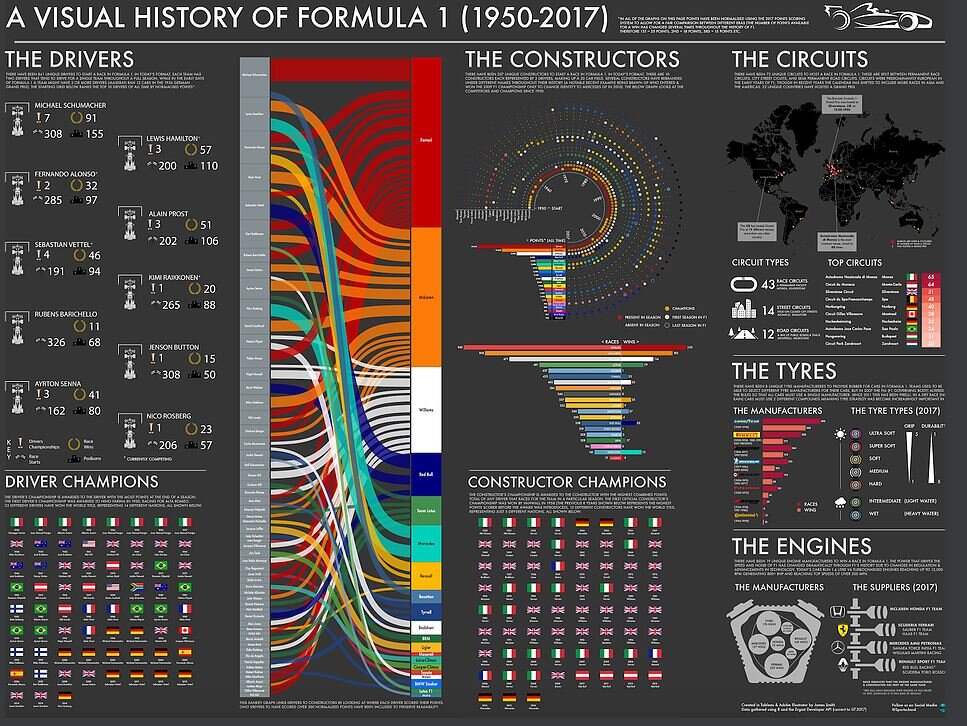
A Visual History of Formula 1 - there’s a lot to look at here, but it’s really nicely compartmentalised and the data is actually really easy to process. Love the use of colours!
This is a great example of different types of visual data being brought together cohesively.
What it’s like to be dyslexic, and what that means for readers everywhere - this is more of an interactive infographic, communicating to readers what it’s like to have dyslexia and why certain typefaces are difficult to read for those with the disease.
It’s evident that careful consideration was taken when choosing the colours and layout of the graphic elements and fonts to be as accessible as possible to the readers.
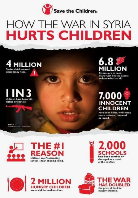
How the war in Syria hurts children, Save the Children - a very powerful infographic. Fantastic numerical information highlighting the atrocities and reality for children living in Syria. Very stripped back in terms of data which really lets their message land and they don’t miss a trick with a clear call to action at the end.
This graphic really engages the reader, making you stop and take notice of the problem. With so few data points mentioned, the reader is far more likely to remember most/all of them. It’s also a clear demonstration that you don’t need a lengthy graphic to make a point.
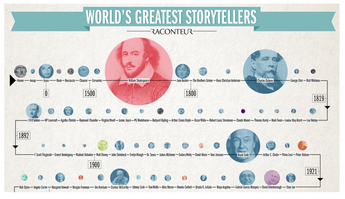
World’s greatest storytellers, Raconteur - this really is a fun bit of learning. It’s a chronological account of some of the best storytellers through time (as voted by 500 journalists, authors, students, and editors).
The storytellers are neatly laid out chronologically through time but the colour indicates what industry they belong to and the scale indicates how many chose that author as favourite.
Left government vs. right government, Information is Beautiful - an excellent comparison graphic highlighting the differences between liberals and republicans in American. Note the clever use of their party colours, red and blue, to establish visual identity for each section.
The 39 stats, charting Hitchcock’s obsessions - we had to include one of our favourites here at Sookio, and for any Hitchcock fans out there! This is a fabulous infographic, from the fonts to the colours and especially the graphics and icons. The whole experience is a delight!
Over to you
So now you’ve spotted some great examples, you can get started creating infographics yourself. There are loads of programmes out there to help bring your design ideas to life - try using free programmes like Canva or Piktochart to get started.
If you need more inspiration, we’ve got more terrific examples on our Pinterest board.
And if you’re looking for a fresh perspective and perhaps a more polished and branded infographic, why don’t you drop us a line and get in touch!


