Above-the-fold website content: What you must include and why
The above-the-fold website content of your home page is your digital business card: will your potential customers use it as a starting point to learn more about you or virtually chuck it into a random pocket?
Understanding above-the-fold marketing helps you strive for the first outcome.
What is ‘above the fold’ on a website?
On a website, ‘above the fold’ refers to the written copy and design elements that a user is presented with before scrolling down.
Funny name, right? Well, the original above-the-fold meaning dates back to good old print publications: it’s the upper half of a newspaper’s front page that, even when folded, lets you read the top story.
The importance of above-the-fold website content
You only have two seconds to catch your users’ attention and eight to retain it: because your above-the-fold content is the first thing they see when landing on your website, it can make all the difference.
Users spend 57% of their page-viewing time above the fold, so this section must be clear, immediate, and convince them to scroll down.
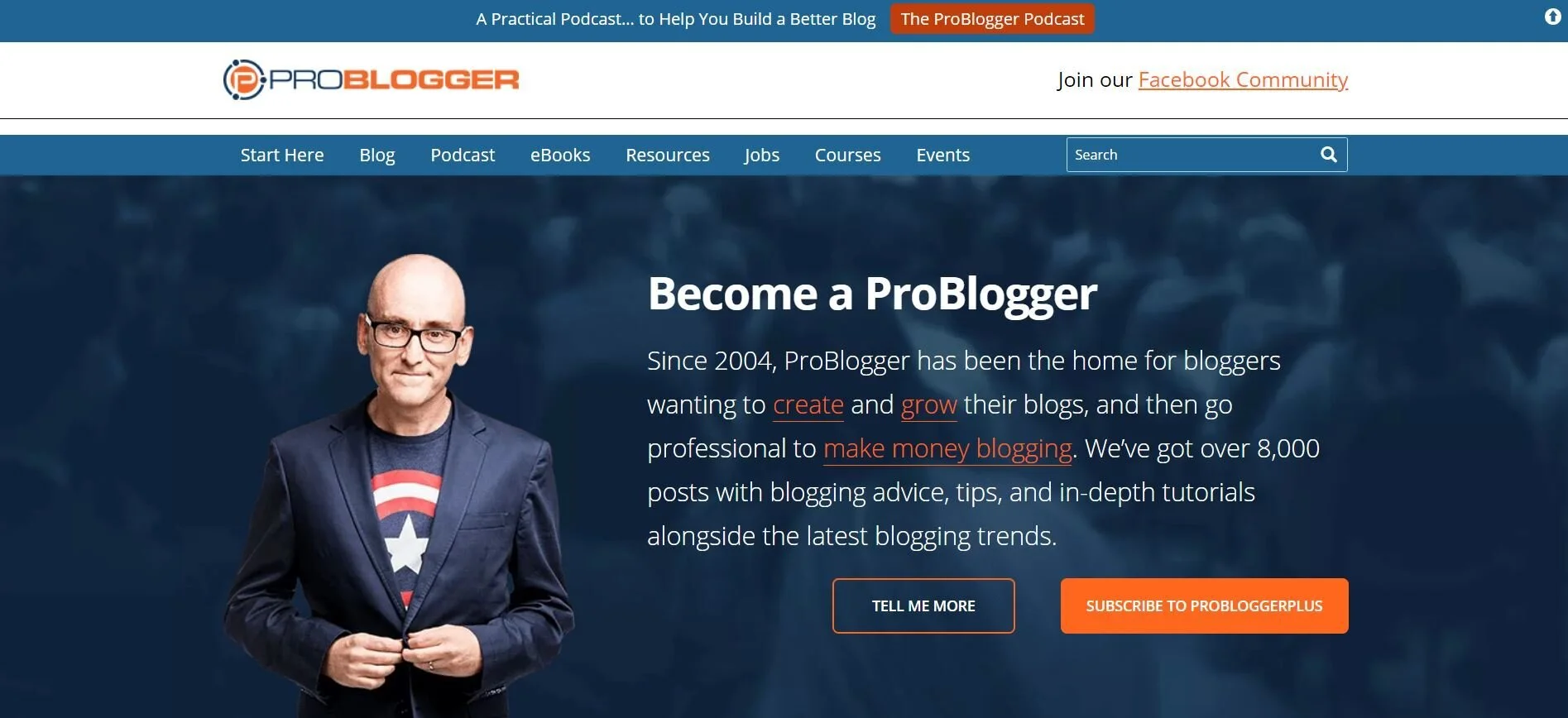
For example, instead of confusing us with hieroglyphic-style statements, ProBlogger tells us they’ll help us become professional bloggers, letting us choose between learning more or subscribing. Easy!
What should be above the fold on your business website?
1. Unique selling proposition
Your users aren’t up for a treasure hunt: they’re here to know exactly what you do, and they want to know it right now.
Don’t make the same mistake as companies that fill their above-the-fold content with vague mission statements!
Before scrolling down, your users must see:
A clear sentence explaining what you do and how this relates to them
If needed, some short explainer copy offering more context.
Look at Wix: they don’t waste time telling us they were founded in 2006 or using vague terms like ‘website solutions’. They confidently position themselves as the best platform to create websites that match our vision.
2. Logo
Whether you’re a startup or a large company, brand recognition is key. Because of the way we scan websites, placing your logo on the left above the fold will result in a stronger brand recall.
This is also your chance to get creative using other graphic elements in relation to it.
See how the Entrepreneurs HQ logo stands out by being one of only three red elements against a cold palette?
3. Simple navigation menu
When you include an intuitive, user-friendly menu (and, if relevant, social links) in your above-the-fold web design, your visitors can choose where to navigate next without getting a headache.
For example, instead of turning their tons of resources into an overwhelming menu, WordPress has clearly divided them into four much tidier categories.
4. Graphic elements representing your brand
Whether that’s a picture or a video, your main above-the-fold visual element should never be filler content. Instead, use it to better convey your brand story or make your audience part of it.
Doesn’t Gail’s Bakery’s picture make you want to have that same tray on your bed tomorrow morning?
5. Call to action (maybe!)
When you add your call to action above the fold, it’s easier to spot it. However, ‘buy now’ is a lot to ask from someone who’s only just landed on your website, which is why having it below the fold can result in a 20% increase in conversions.
Here are some compromises that could work better for your specific business website:
Consider repeating your call to action both above and below the fold like Oxfam. First, they inspire a sense of urgency. Then, when scrolling down, they tell us other ways in which we can help before placing the same action button at the bottom of the page.
If your main call to action is below, your above-the-fold content should still include a simple way of getting there. See how the ‘subscribe’ button stands out on The Simple Dollar’s website by being in a different colour than the menu?
Eager to know more?
Learn even more about above-the-fold website content and effective tricks on writing for the web by booking our Digital copywriting course or getting in touch. We’d love to help!


