Website under the weather? Get a prescription from the UX Doctor
How do people feel when they interact with your website or app? Is it a positive, seamless experience where they come away with all the information (or purchases) they need? Or do they find your tone of voice unwelcoming and the cluttered content difficult to navigate?
We spoke to Dom Reed, Founder of UX Doctor, to find out how good content is crucial in creating a positive experience for your users.
Hello Dom. So you knew this would be our first question: what does UX actually mean?
User Experience is a very broad discipline, but a definition I like is from the Nielsen Norman Group, which describes UX as ‘all aspects of the end-user’s interaction with the company, its services and its products’.
In practical terms, that means us UX people will attempt to make improvements in the usability, usefulness, aesthetics, brand, tone of device, delightfulness, and quality of a product. That’s a broad set of skills, so UX is really a team sport.
Apple's user-friendly website features clear text, crisp images, and quick links to informative videos
And how did you become an expert in UX? Tell us a bit about your background.
I took a degree in ergonomics because I loved the scientific approach to designing tools that better match human capabilities.
In the early years I focused more on the physical ergonomics of products, working at NCR on automated teller machines, and then mobile phones for Nokia over in Finland.
I suppose it became easier to work in software with the boom in the internet and digital products, so I found myself increasingly working for software companies like Redgate here in Cambridge.
I’ve spent about 20 years now as a UX practitioner. Most frequently working on technically feisty B2B applications, but equally working on some consumer products too.
I’ve run my own UX consultancy for the last three years helping a wide variety of companies nudge their UX up a notch or two.
What are the common problems that you come up against?
The biggest by far is simply not involving users in the product development process.
Many companies don’t conduct any, enough, or the right type of user research and they’re probably not doing any kind of usability testing either. Without an ever-present way to understand the user’s needs, experience and environment, bad products get built.
Most likely as a consequence of not involving users, the second most-common problem I see are products crammed full of features users don’t need or know how to use.
There’s normally a well-meaning product manager of developer somewhere who’s adding more functionality thinking they’re helping the user; or worse, hoping that adding this one additional feature will be what finally makes our product succeed.
It can be a similar story with content and websites, where a lack of empathy or understanding of what your user needs leads to poor experiences.
Do people realise there is a need for UX?
We ask this because often people know they need a new website, but don’t appreciate at first the difference between the design and the content that goes on it…do people understand what you mean by user experience and why it’s so important?
It’s a pretty rare thing to find a company that has UX baked into its genes, so people only tend to realise they need to improve their UX when they have some kind of problem.
They might notice that people aren’t getting all the way through a process, or that they’re receiving too many support requests. They might also hear the sales team complaining that the product is too complicated, or more generally, that the company is losing market share to newer, shinier competitors.
With websites, you might see people leaving the site quickly or not navigating where you expect them to. Ultimately, it might just be very quiet with your users never achieving what they came to do.
There’s certainly a lack of understanding about how you improve a UX, and many companies think it’s something they can simply sprinkle over their product. Whilst you can make improvements by tightening up the aesthetics, copy and fixing some usability bugs, the problems are often rooted in overly-complicated workflows, missing functionality, or unnecessary functionality.
How do you pinpoint which issue is causing a problem?
For example, is the wording putting people off or is it really that the website is so slow to load?
Testing with users is the simplest way to identify where the problems are. Find a small number of representative users, set them some tasks to complete with your website or product, and observe where they trip up. It’s the most amazing thing.
You’ll learn so much you’ll wonder why you haven’t been doing it forever. There are a few things to be mindful of, but tests are remarkably simple to carry out and you only need about 5-7 users to uncover your most serious problems.
Seasoned UX people will often be able to spot some of the problems without testing if they’ve seen them many times before. There are also systematic processes you can follow to uncover usability problems, like heuristic analyses.
What are the main elements of design that make for a good – or a bad – user experience?
In most user interfaces, the main goal is clarity. It needs to be very clear where you are, what you can do, and how you go about it.
To achieve clarity you need a relentless focus on stripping away what’s unnecessary so that the important stuff isn’t hidden. That means simple, unambiguous language and a good use of empty space and contrast so your eye lands where it needs to.
If you achieve that clarity, a user feels in control of their task and isn’t made to feel stupid by misinterpreting what they’re seeing. The interface appears informative, simple, and quick to take in.
What are the simple approaches to good UX that we should consider as content creators?
Every interface exists to do something, whether it’s a marketing webpage or some control panel in a nuclear power station. Knowing what that something is and who the users are means you’re in a better position to design it properly.
If you’re able to clearly articulate who the user is, the interface’s purpose, and what you expect a user to be able to do as a result of using it, then you know what content you need to provide to support it.
Being aware of why the content exists is paramount. Is there too little or too much to achieve the goal? Is the content that’s tasked with a certain goal doing it effectively? How could it be made more efficient?
healthy snacking company graze clearly communicate to their target users, or customers
What advice would you give copywriters on UX? How can they work with the design and development folk to produce the best experience for the user?
There’s a huge overlap between copywriters and people who have UX in their job title, and even developers - though it often doesn’t seem that way.
Ultimately the user’s experience is a result of everyone’s work, whether that’s the words they read, the design of the interface they live in, or the technical shenanigans that go into making it possible at all. When teams understand that UX is a shared responsibility and that everyone has a role in creating the best experience for the user, things get easier.
The best way I’ve seen to build an understanding that UX is a team sport is to ensure everyone gets exposed to real users. Run usability tests with the whole team observing. Rotate who you take out on user research interviews. When the team feels empathy for the user first-hand, the magic starts to happen.
How about calls to action – are they important or is it all about, say, what colours the buttons are and where they’re placed?
You may have seen Jamie Bartlett's BBC series The Secrets of Silicon Valley which showed how Trump’s digital campaign tested hundreds of iterations of the donation page to see how button placement and colour brought in the most dollars...
It’s pretty dangerous to assert a set of rules that guarantee certain success. There’s no one perfect colour, or magic words that will always generate more clicks than some other words. Every call to action exists in the context of a task and its immediate surrounding, and what works well in one place might work terribly in another.
For example, a button that says ‘Buy now’ is never going to get clicked if the rest of the webpage hasn’t done a good enough job of driving the motivation to click it. It’s almost of secondary importance that the call to action is obvious, both in aesthetics and wording.
If the motivation is strong enough a user will probably find even the most poorly designed call to action button, though that’s a pretty poor experience to inflict that on them!
It’s always possible to tweak conversion rates higher by running A/B tests and the like on individual call to actions, but the biggest improvements often come through bolder endeavours that look at the goal more widely.
Tell us about any particular brands who do it well, or a website that is particularly good on UX
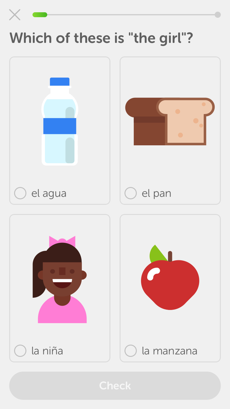
I'm a huge fan of Duolingo. Their whole website, onboarding experience and the app itself is a great example of how to create engaging and simple products.
Every word in their copy feels like its been carefully chosen to appeal to their users' questions and anxieties. There's a lovely friendly tone, their look and feel is consistent, and there's not an ounce of fat anywhere.
Another experience that recently made me stop to appreciate it was buying an Amazon Fire stick for my TV, and later an Echo (Alexa) which works similarly.
Where most products require a heap of setup when they finally arrive, both of these were pre-configured to use my Amazon account. They knew I’d placed the order with my account, so shipped with that account set as default. It was a seamless experience that just worked.
The easy thing to do would have been to just ask the user to sign in on their new product. But Amazon have managed to join up multiple parts of their organisation and ship pre-configured products to their users – a technical headache no doubt to make each box bespoke, but it saved me typing a random forty-character password into my TV.
This level of attention to UX is clearly going beyond just improving bits here and there – it’s a joined-up approach looking at the whole process from webpage to working product in a living room.
How does the user experience differ on mobile and desktop?
For example, when I buy a flight on from the Ryanair website, I come away feeling they had only mild contempt for me as a customer, whereas on desktop it feels like total hatred.
What’s important, is to remember the context. It’s not strictly true that mobiles have killed the need for desktop sites or apps, they’ve just reached out into other parts of our lives. So how people use a desktop app or site and how they might use a mobile equivalent can be similar but also wildly different.
Mobile can tap into a wealth of sensors and a user’s location that can help them do things that would be impossible on a desktop. They might also just concentrate on a few key tasks that are appropriate for someone who could be in a hectic location with an intermittent signal.
And conversely, a desktop provides a more expansive environment that is typically more suited to content creation and tasks that require deep focus. The best examples of good user experiences take advantage of the context, and the worst try to replicate the exact same functionality on both.
What can you suggest businesses do if they want to make the user experience on mobile as good as desktop?
Understand that the two platforms aren’t the same and play to the strengths of each. Really try to understand what your user needs in the different contexts.
How about accessibility – what are the things that people overlook which would make websites easier to use for visually impaired people and those with other disabilities?
Paying attention to accessibility, both on desktop and mobile, usually results in a better experience for everybody.
Having sufficient contrast, appropriate font sizes and sensible colour combinations makes it easier for everyone, not just those with some kind of impairment. It’s also worth remembering that all users can easily become impaired in some way, by losing their glasses, being in a noisy environment, or having a slow network connection that means images won’t download.
It’s a similar story with copy. It’s best to use simple words that everyone understands instead of words that might make you feel clever, but that alienate some of your audience.
NHS Choices is a great example of accessible web content, with a prominent search box, quick links to commonly searched conditions and clear, high-contrast text, making it easier to read for the visually impaired.
What easy tweaks can you suggest to improve the UX - ahead of a total site redesign?
I don’t think I’ve ever seen a website that wouldn’t benefit from reducing the amount of stuff it shows.
So, remove redundant content, reduce the word count to make your content quicker to digest. Seek out and destroy needless repetition. Introduce more empty space to let the content breathe.
It’s so common to see great content rendered hidden in overly busy interfaces. With too much vying for attention, too many distractions and an unclear expectation of where you’d like the user to go next. Strip things back a bit, don’t bombard the user, keep things more focussed.
A bit of a spring clean to remove the cruft you’ve accumulated will reveal a bit more of the original, efficient beauty. It’s easy to lose track that your site has put on a bit of weight.
How do you measure this so you know it’s all worked?
Always be testing. No website or user interface is ever complete.
You’ll want to continually collect benchmark data, but more than that, I’d suggest that there’s a continual involvement of your users in your development process. It stops you losing focus, building or delivering the wrong things, and keeps everyone in contact with why all of it matters.
Your users are your lifeblood and you have to understand them to know if you’re destined for glory or doom.
Looking to make your website, software or application more user-friendly? Dom comes highly recommended for all your UX needs. You can get in touch on the UX Doctor website, or on Twitter @UX_Doctor.
For content creation support, talk to Sookio today.
Useful links
Follow @UX_Doctor on Twitter
You may also like
What can pro wrestling teach us about content strategy?
How to write product descriptions that actually sell
5 ways design can enhance your digital content


