Learning to love the Guardian style guide
Content writer Freddie Reynolds - who knows his way round the style guides for The Sun, Sunday Times and The Times - explains their importance in helping brands like Innocent Drinks keep their brand voice consistent, and shares tips on stylin' it yourself.
Unifying your company’s message is vital to achieving all those back-of-the-napkin goals you set yourself way back when. Consider brands like Apple or Google or even that chain of sandwich shops you try and fail to avoid every lunchtime. All conform to a specific aesthetic. All are instantly recognisable, instantly appealing.
Some of that is down to design, but there’s something in the wording, too. And that comes from a style guide, a fabled object that leans on staff shoulders and demands consistency through grammar, tone, formatting and terminology – consistency across everything, from posters to wrappers to Facebook posts.
Traditionally style guides were the staple of the eternally suffering newspaper sub. Widely embraced at a time when news still broke on paper – ‘comment is free, but facts are sacred’, wrote Charles Prestwich Scott, editor of The Guardian when the newspaper’s first style guide appeared back in the 1920s – they contained notes on which words to hyphenate, which numbers to write out in full or when to capitalise Prime Minister. You can now access the guide in book form or online.

Lifetimes on, these legendary etymological tomes have burst their bindings – are The Beatles the Beatles or The Beatles?; Wi-Fi, WiFi or wi-fi?; WTF, is that even allowed?; how about italics? And though newspapers in their traditional sense have stumbled, we’ve never, ever published as much as we do now.
Because now we’re all at it.
Everyone has access to a public platform on which to comment, command, vent or sell. Content used to come in columns, now it also comes in stacks and feeds, tweets and leads. Fine and fun and brilliant and oh so democratic, but when a single 140-character comment can prompt a public outcry, it’s vital you concern yourself with what’s being said.
At Sookio it's become a natural extension of copywriting projects, with clients saying, "We love the copy, now can you give us guidance on house style so we can continue to keep it updated with consistency in house?"
Defining the tone of voice
Style guides are a great way of helping to define (and align) what you’re about and why someone might choose to engage with you.
I’ve done some work with The Times and The Sun over the past few years, and, as you might imagine, their style guides differ drastically (though even The Sun shuns exclamation marks). Both are a great example of relating to a certain readership. The former is largely read by wealthier males whilst products sold in the latter are bought by mums. Both audiences, however, prefer something of value over something that’s cheap. And both want a product they can trust.
The New Yorker’s house style is legendary (and prompts articles all of its own – read Holy Writ: Learning to love the house-style by Mary Norris). Prefixed by a document entitled Theory and Practice, it ensures the readership that those 10,000-word articles are well worth reading. ‘Anything that you suspect of being a cliché undoubtedly is one, and had better be removed,’ it instructs.
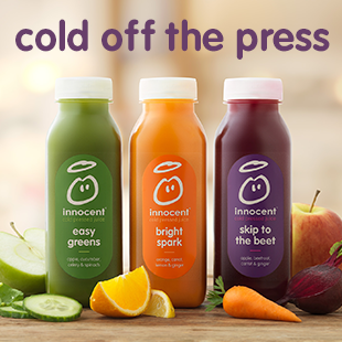
And on the other end of the scale is Innocent Drinks, a multi-million pound company who evidently don’t take themselves too seriously. After all, all they’re really doing is selling fruit that’s been squashed to within a pith of its life.
Here are some examples from this brand:
Thirsty? Say hello to our coconut water. It won't say hello back, but it tastes great. pic.twitter.com/wKrHjbXLZu
— innocent drinks (@innocent) January 27, 2016or
Pretty sure an upside down hashtag has never trended. We can make history today if we all rally behind #ʎɐpɐᴉlɐɹʇsnɐ
https://twitter.com/innocent/status/691900255131009025
Pretty sure an upside down hashtag has never trended. We can make history today if we all rally behind #ʎɐpɐᴉlɐɹʇsnɐ
— innocent drinks (@innocent) January 26, 2016or this blog post. Note how they also shun capital letters in their headlines. That’s a conscious decision, written in the style guide – another example of aligning content with the wider brand.

Innocent is a wonderful example of how you can be creative with a style guide and how you can inject a lot of fun into a brand without it feeling crass or low brow or somehow off in its execution.
Their guide is encouraging them to go out and have some fun, and so sincere are they in their ambition to amuse and so complete and cohesive is the output, that they entirely justify their tagline: ‘innocent by nature’.
Stylin' it yourself
If you’re starting from scratch, then establishing a tone of voice before you start marketing yourself can be amazingly beneficial. Deciding how you want to come across to your audience can help you define what your company is all about. So pluck out a few words – informative, friendly, shouty (not recommended) – and then go from there.
If you’re a tech company selling to the public, then you might want to avoid using too much jargon. If you’re a government department concerned with tax, then you might not aim for the ‘chatty’ angle. How you refer to people is key – instead of ‘kids’ you might want to say ‘young people’. And a ‘swarm of migrants’? Definitely not, Dave.
If you’re up and running then there’s no need to tear up everything you’ve ever done and start again. Chances are you’ve been sticking to a set of rules even if they’ve never been written down. Remember, putting a style guide together is an open ended process and evolves with the brand. Have a look at what you’ve been doing, what competitors are up to, and see if it’s worth changing direction.
Unless you’re a publisher with endless time on your hands, it’s probably not worth worrying about whether to spell ‘internet’ with a capital ‘I’ or not. You can simply download the BBC News style guide for free, look at guidance from Government Digital Services in the GOV.UK style guide and keep an eye on the Guardian’s guide online and follow @GuardianStyle on Twitter. Because nothing kills a line like a spelling mistkae.
‘Do not mention rice and beef and wheat…’
Poor phrases and ill-chosen clichés can destroy productivity, kill whole genres.
The Kenyan author Binyavanga Wainaina got so irate with western books about Africa that he took the style guide concept and ran with it, writing the (short) essay ‘How to Write about Africa’ for Granta.

Wonderfully sharp-witted, it’s something I often think about when cobbling style guides together, and might be a handy way of introducing them to a yet-to-be-converted team.

Style guides are about keeping tone and messaging consistent, aligning the brand and guiding your team on how to write for their audience.
Sometimes remembering how things shouldn’t be communicated is a good a way of focusing your mind on how things should.
Freddie Reynolds in a content writer and editor based in Cambridge. Former deputy editor of Traveller, the UK’s longest-running travel magazine, he has worked with News UK, the Refugee Council and a number of leading travel brands. You can find him at freddiereynolds.com and @fcsreynolds.