Communication for startups: From complex thinking to clear messaging
If you're an early stage company looking to capture the attention of investors and buyers, it's essential that you get your message across with clarity from day one. Guess what - we've got some tips to help you do just that, plus lots of examples to give you inspiration.
You just can't walk down the street in Cambridge nowadays without tripping over a hot startup. Sparks of innovation are everywhere, not just in the many enterprise zones where young businesses set up and scale up, but throughout the city with entrepreneurs tucked away in little corners where their ideas can thrive.
Communicating the value of these ideas can often be tricky, particularly when the core team is very technical. It can be a struggle to get across what the product or service is all about. Sometimes it doesn't even exist yet! And if consumers and investors don’t 'get it' straight away the business will lose valuable attention in the early days, slowing down growth.
This is particularly prevalent in somewhere like Cambridge where there is a concentration of academics and highly technical people, who are used to complex terminology and explaining things in depth.
However, when you’re talking about communicating clearly on the web and reaching a flighty audience more used to clicking and swiping than reading a lengthy thesis, a different style of writing is needed.
Before you start writing, think…
Are you talking to other businesses, investors or consumers?
Is it a specialist audience or are they just passing through?
How much of what you say will be familiar and how much will you have to explain?
Why are people visiting your site? Perhaps they want inspiration about how your product will benefit their lives, or information about features and cost to help them make a purchasing decision. Or maybe they’ve heard about you and are just curious to find out more.
Which part of the site are you writing? A homepage should offer broad brush strokes, whereas the inner pages will have the detail and full product spec.
See how giftgaming make it clear that they’re talking to brands and publishers rather than consumers. They’re showing the benefits and highlighting them from the outset.
DuoFertility talk directly to the consumer, honing in on their pain points. ‘Wish you could take the stress and guesswork out of trying for a baby?” To which the answer, for a lot of people, is yes.
Put the good stuff first!
This is all about front-loading your content. Don’t expect people to read every word you write – they will scan the page, taking in about a third of what they see.
Typically, people do this in an F pattern, seeing the top, upper left corner and left sides of the screen most, only occasionally taking glances towards the right side of the screen.
So you need to put the relevant bits first so readers know exactly what they’re going to get. Don’t make them work for it!
This means putting keywords at the start of your titles, starting blog posts with a summary and making everything comes with a good meta description which will show up in the Google search results. Don't forget images too! We process images 60,000 times as quickly as text, so make these powerful too.
See how news organisations like the BBC front-load their content, placing important keywords at the beginning of each story so you can scan the page and find content of most interest to you. Each title also makes sense in isolation, so you don’t have to click through to the story to find out what it’s about.
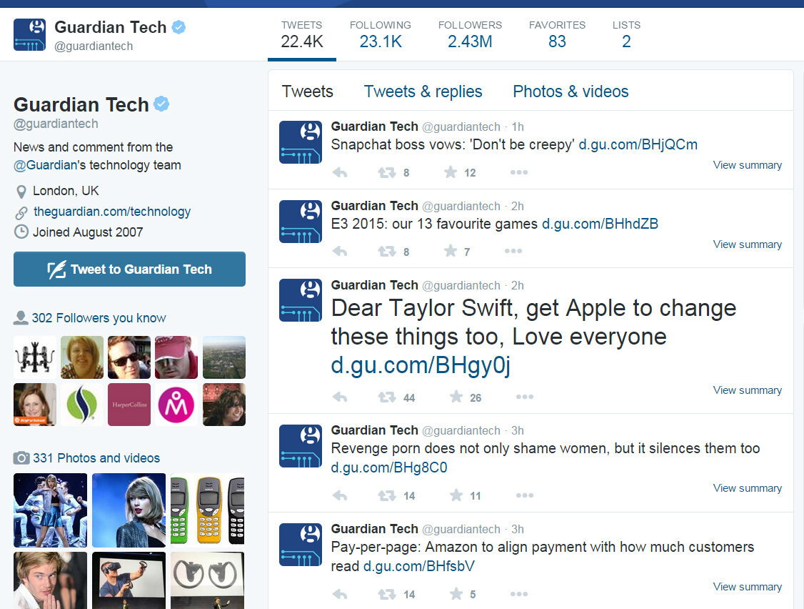
Front-loading works in social media too! @Guardiantech tend to put keywords at the start of their tweets and posts, which helps readers find the content most relevant to them as they're scanning their Twitter feed.
This example from Cambridge startup Bromium pulls it all together:
Strong title
Resources at the top so you can find what you need
Keyword-rich intro gives you lots of reason to read on
Why is plain English so important?
We’re always having arguments with people about this! It’s not about dumbing down. It’s about making sure your content is easy to read and understood by more people.
The first few thousand words we learn we recognise by shape alone. When you see a common word like ‘and’ you don’t mentally spell out the letters, you just recognise it. We call these Bouma shapes, after a Dutch psychologist who identified this concept.
So with words in block capitals or those over 8-9 letters long the brain stumbles a bit, meaning the reader retains less of what you’re saying.
So channel George Orwell and his 1946 essay Politics and the English Language, in particular rules 2 and 3:
Never use a long word where a short one will do.
If it is possible to cut a word out, always cut it out.
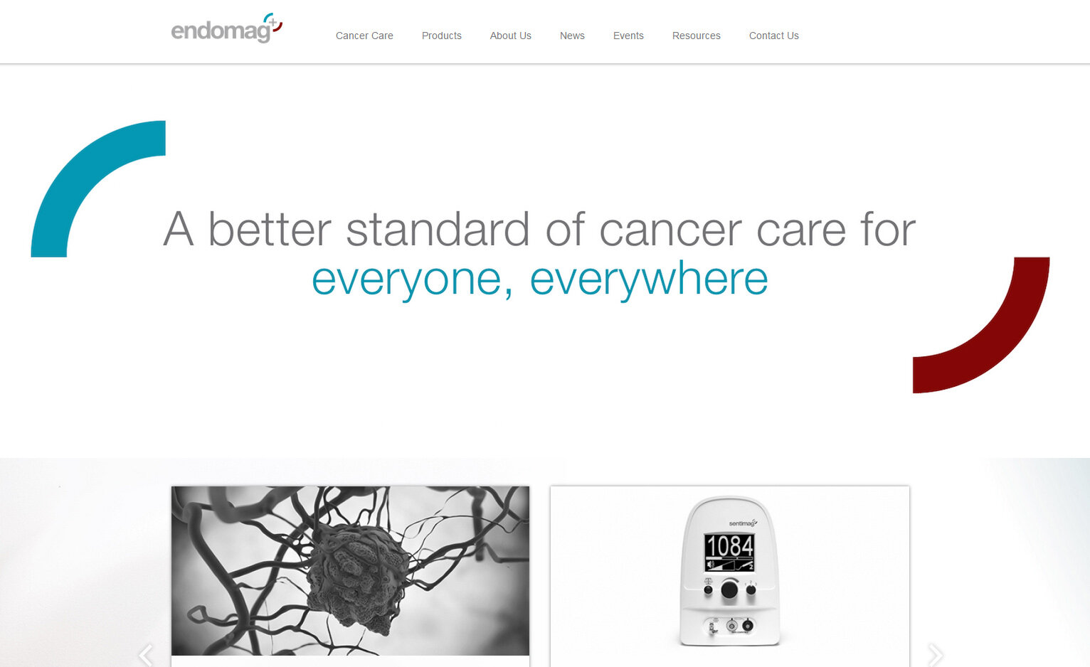
Endomag do this here, explaining their work in the complex field of cancer care in very simple language which everyone will understand.
How to make it easy to read
Some simple tips which can transform longwinded text into something people will actually read:
Break it up! More white space helps you recognise the words simply by shape
Make friends with line breaks, headings and bullet points
Keep sentences below 25 words
Here, My Parcel Delivery have plenty of space around the words, short sentence and they talk directly to you, no waffle, no passive voice.
Jukedeck use icons to complement text and have a visual impact. Like My parcel Delivery, they also have plenty of space around the words and talk in short sentences.
Clinked like using bullet points and sub-headings to help people scan their content and understand it at a glance. Plenty of white space around the words and short sentences makes it nice and easy to read.
Communicate with confidence!
We work with startups and early businesses in Cambridge, London and beyond to help them communicate more clearly through digital content. That's everything from copywriting, infographics, blogging, video, email marketing and social media updates to expert strategy and tailored training packages.
Get in touch if you are in need of communications support, and sign up to our mailing list for a monthly blast of tips and tricks.


